As the year is drawing to a close and the summer insanity is giving its place to the melancholy of a pumpkin-spiced autumn, let’s see what the workhorses of the web design industry introduced to the world.
The mysterious nature of trends did not fail us again this time. If there is an obvious shift that the year of 2017 will be remembered for, it’s the apparent rise of the systematic approach. Simply put by Chris Coyier of CSS-Tricks,
#We’re not building pages, we’re building systems.
This year has seen the amplification of all things UX, one of the crucial principles of which is the immersiveness of the experience a digital product builds around itself. This why design systems are getting huge, capturing more and more aspects. UI kits, pattern libraries, style manuals, and signature design guidelines are the parts of the immersive interaction that we strive to create.
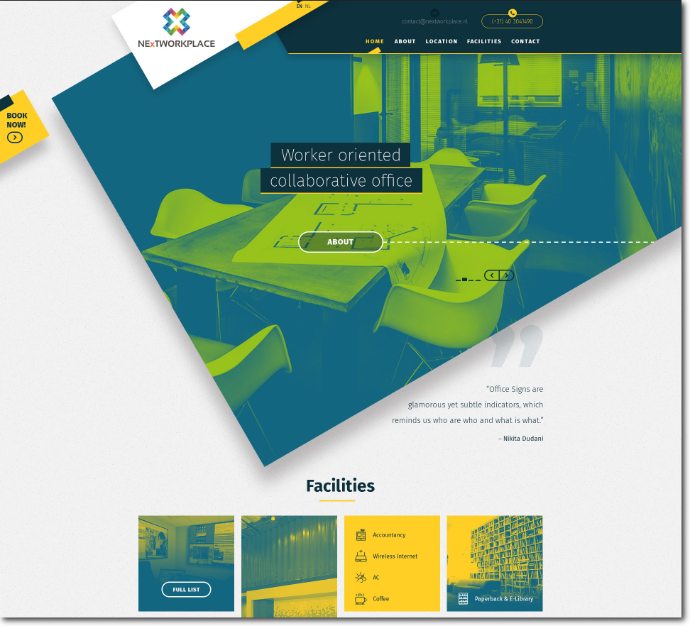
Asymmetric Layouts
Symmetry was the staple of the industry established as the most logical and convenient way of presenting the content. Grid systems focused specifically of the machine-made alignments and visual hierarchy of elements. However, as grid systems were evolving, they started to show the evidence of asymmetric inclination. The “Grid Systems: Principles of Organizing Type” book by Kimberly Elamconveys multiple asymmetric layout examples and principles.
The idea of “broken” layouts is certainly not fresh, but it hasn’t been explored widely yet, that’s why this trend is considered to be one of the most significant ones, as it gives designers a creative freedom to roam around and make their brand stand out. What’s cool about asymmetric layouts is the fact, that they can be broken in a variety of ways depending on a designer’s vision, their knowledge of user perception, typography integration ideas, and content distribution.
Asymmetry is controlled chaos, physically balanced to create elemental force presence.
With meaningful motion and smart parallax effects that web designers are getting more proficient with, broken and asymmetric layouts are definitely to be weaponized next season.
Tactile Design
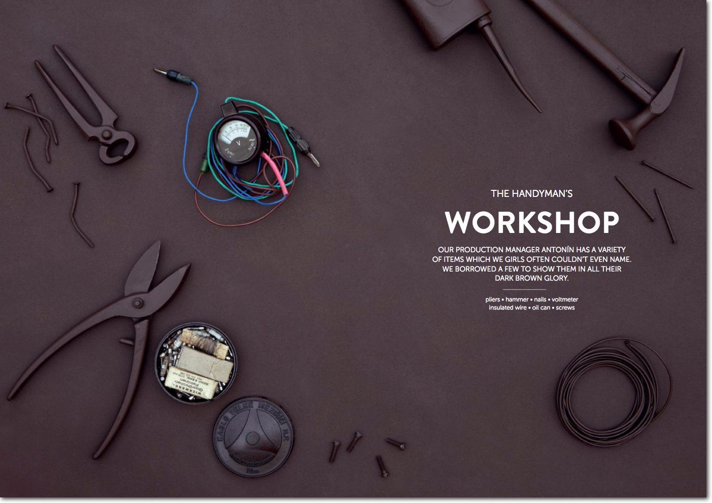
As history infinitely spirals its way to the future, we never expect it to bring forth the forsaken tendencies in their original way. The deeply-rooted origins of web design lie in physical things, thus, skeuomorphism. However, the eclecticism of styles, metaphoric art, and imagination have withdrawn web design to a different landscape.
We’ve forsaken skeuomorphism in favor of material and flat design, only to witness the reincarnation of it in tactile design. The reality, however, never left us. It was angled, transformed, distorted, and augmented but truth is, every design element has to have a clear representation of the real world objects.
The tactile design principles are flamboyantly showcasing the reality almost in a way that you can reach out and touch things. It’s a challenge that, if faced right can step your game up in terms of uniqueness and user appreciation.
Custom Typography
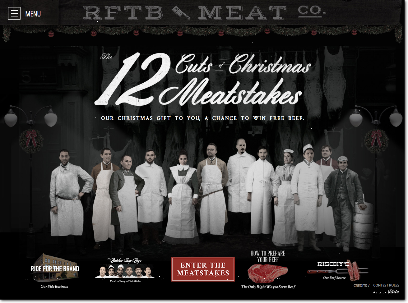
The broken layout trend reverberates strongly in the typography realm. Big, bold, and reach lettering, often times hand-crafted and custom, add to the effect of asymmetric layouts. Oversized letters apart from conveying information can serve as visual cues and dingbats. Putting together typographic collages consisting of different font families and even contrasting typefaces is what we can expect to be a keystone in web lettering design.
All this is possible due to the growing compatibility of web fonts. The sans serif fonts dominating interfaces are getting diluted with unusual and exclusive typefaces which once again contribute to the immersive experience of a digital product.
Authentic Imagery
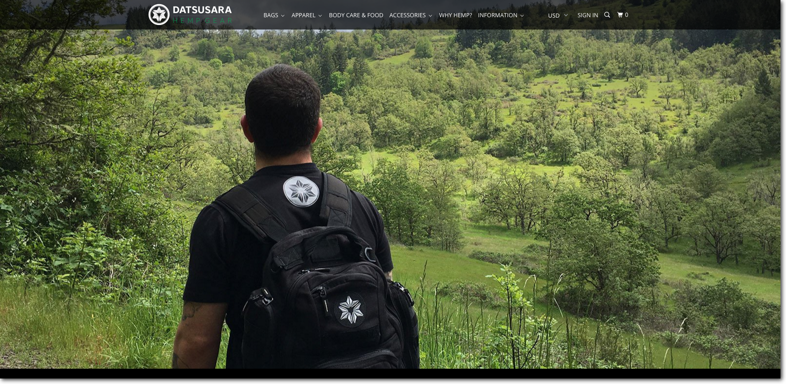
Custom typography can’t be associated with stock photography. A fully authentic experience can only be created by such a powerful visual tool as photography. Custom images convey the brand’s message in its own unique way, free from the influence of a third-party vision. In this case, the interpretation of imagery, as well as the company identity spread across it becomes an influence tool, rather than just a generic plug.
The temptation to choose images from the millions available is pretty high, but this is how we tend to make a compromise with what we can find instead of creating an entirely original photograph, assigned uniquely to your brand.
But what if you are short on time/resource to hire a photographer or have difficulty identifying the end product? One of the ways accepted in 2017 as part of the content-first meaningful approach, is introducing users to the process. One of my favorite examples of a social media campaign and a custom promo photo harvest is a contest by Datsusara. They collected hi-res photos of people in the Datsusara gear and awarded the winners with a $100 worth of products. The best images were used on the website. Pretty darn genius if you ask me.
Prototyping Tools & Design Version Control
Sketch
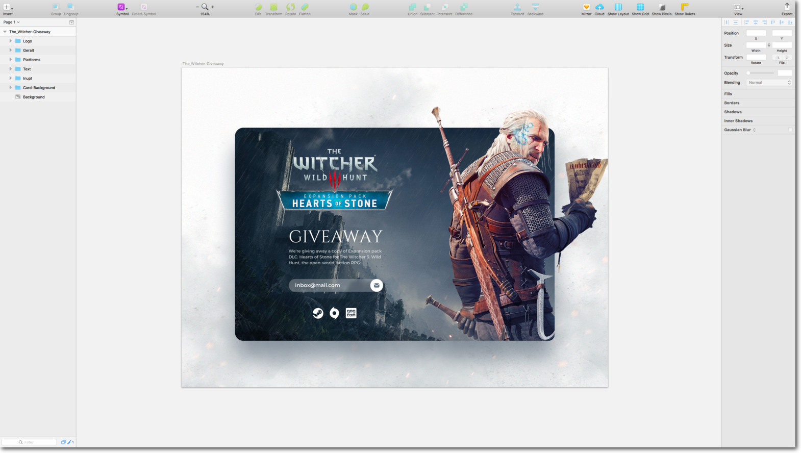
One of the biggest breakthroughs in terms of design software this year belongs to Sketch. Make no doubt about it, Sketch has been around for quite a while but it’s mid-2017 that we’ve seen major design agencies and freelancers gravitate to Sketch as their primary prototyping tool.
This achievement has a number of reasons, all of them combined making Sketch aS Swiss army tool for UI/UX web/mobile designers. Generally, Sketch has the stuff but not the fluff. It’s an interaction design tool to the core with no irrelevant 3D features, photo filters, retouch tools, etc. Instead, it’s a modular multi-plugin application focused solely on mitigating the hassle in UI design. In a nutshell, 2017’s Sketch is:
- Equipped with artboards and moodboards.
- Has an expandable plugin manager in Sketch Toolbox.
- Vector-based.
- Device-compatible through Sketch Mirror.
- CSS-oriented.
Abstract
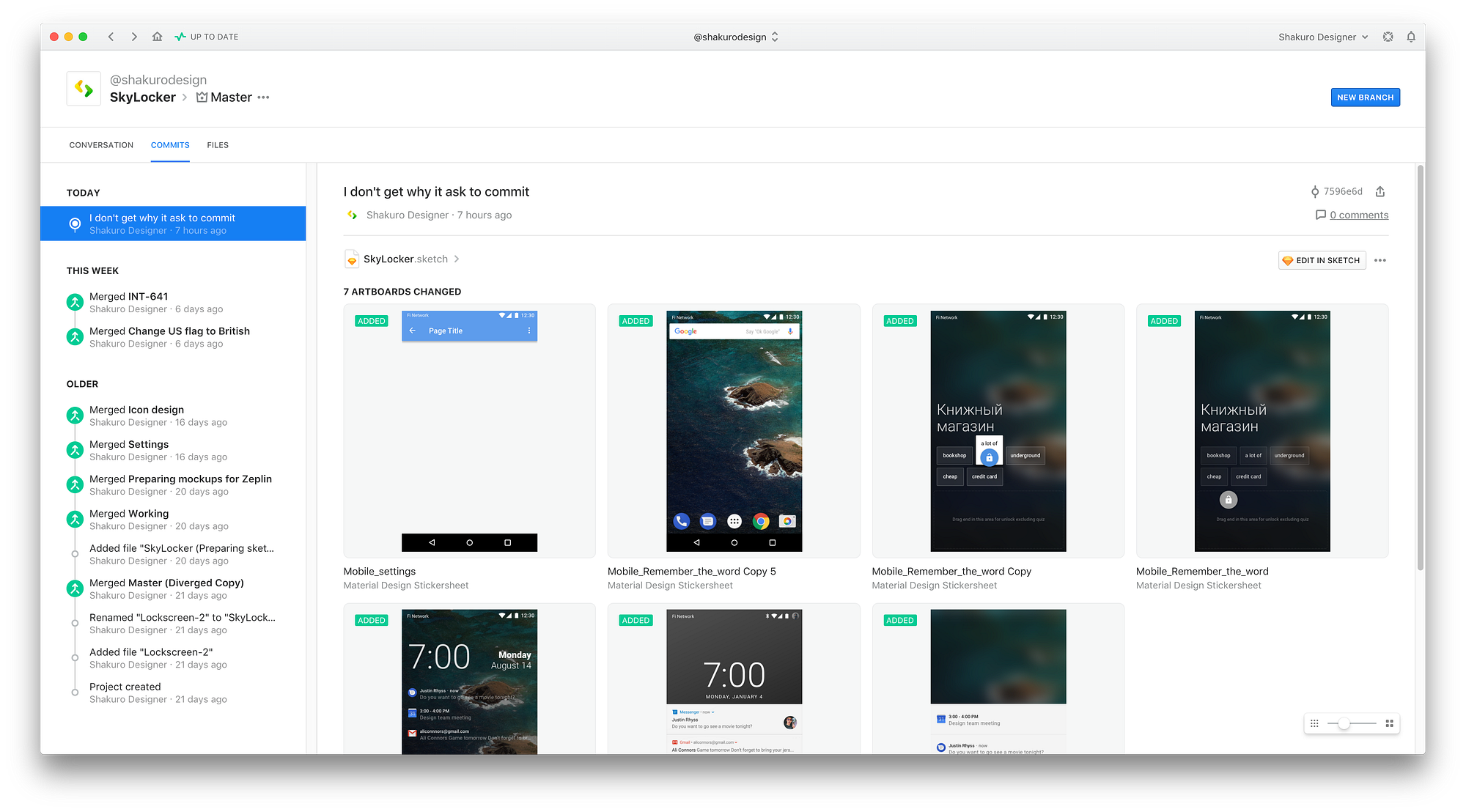
Version control has always been a cornerstone in design. What has always existed in the developer community, was a pipedream for designers. There have been several attempts to create a ‘GitHub’ for design, but they never really popped, some agencies introduced their own custom solutions, but again that is not a wholesome approach. So the struggle continued up until Abstract was launched early this year.
Abstract is a version control system tool for Sketch exclusively. It’s clean and simple UI hides a powerful and unprecedented potential for a team of designers to work on the same project and not get entangled in revisions and timelines. Abstract has offline support for branching, editing files, committing, and merging.
Even though Abstract is facing multiple challenges being new to the market, it has nothing but bright future perspectives ahead. First of the kind, it’s an obligation for any diverse design team of today to try it out.
UX Writing
Traditionally, main UX vehicles have always been graphics and visual interface elements. Textual content was considered secondary and explanatory. It’s obvious that visual elements trigger comprehension on the surface level, however, a deeper understanding required a different approach. The rise of AI capabilities, conversational design, and interaction-heavy UIs discovered a gap between how the slick UX practices work and how these can be transmitted through words.
UX writing or words design, I believe is a logical progression of the meaningful trend in design. The content-first approach had to find its way to the most powerful sense-bearing media — text. Make no doubt about it, every statement any major brand makes these days is designed carefully to convey a certain meaning in the brand’s voice and tone.
Word design is a fairly new trend but it is here to stay as more and more companies start getting the competitive edge and take their products to the next level of appreciation. It is only a matter of time that chatbots, taught with UX in mind will take over. A lot of them are capable of cracking you up already while being sharp and goal-oriented. All these strategies require deep knowledge of psychology, keen understanding of people, and language brilliance. I am extremely excited about what’s coming in the field of UX writing.

Visuals get dated but words never lose their power. As Bel Kaufman once famously said: “To the young, cliches seem freshly minted.”
The Wrap-Up
These are just some of the trends we could think of as most significant and interesting ones. In an ever changing industry of web design, where we constantly search for new ways to astound everybody including ourselves, trends are translucent and perception is the key.
The general shift towards ubiquity even at the expense of a safe place seems to be the main characteristic feature, as more technologies entwine everyday life. Fulfilling tasks is no longer the sole objective. The experience of human-machine interaction along the way has to be meaningful, engaging, and delightful; and this is the path that UI/UX designers seem to have roughcasted for the next year or so.


